Table usability: helping leaders find the messages that matter
The existing View Messages page was difficult to filter and nearly impossible to customize, which meant leaders rarely used it. I took the initiative to redesign the filtering and table experience, introducing collapsible filters, multi-select options, and column customization. Though not originally planned, this improvement was prioritized because it turned an underused page into one that felt intuitive and enterprise-ready.

.png)
Sole Product Designer
Aug - Sep 2025
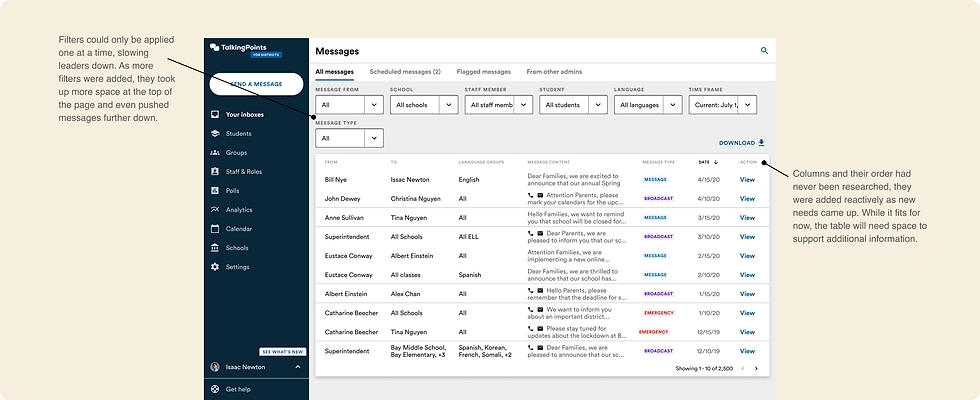
Current view messages page
On the TalkingPoints district platform, the View Messages page is designed to show every message sent across schools. With hundreds of messages being exchanged each day, this page should be a critical tool for accountability and compliance. In reality, it was rarely used. Leaders struggled to navigate the sheer volume of messages, and without effective filtering or customization, it was difficult to locate the information they needed.
problem
Sole designer (with input from designer, PM, and engineers)
Identified usability gaps while working on another update, gathered context from teammates to understand how the page was being used, and proposed a new filtering and table experience. Designed new solution, advocated for this improvement to be added to the roadmap and worked with engineering to implement.
My role
Sole designer (with input from designer, PM, and engineers)
Identified usability gaps while working on another update, gathered context from teammates to understand how the page was being used, and proposed a new filtering and table experience. Designed new solution, advocated for this improvement to be added to the roadmap and worked with engineering to implement.
The Design
I focused on three key improvements that would make the page easier to use while also preparing it to handle future growth.
1. Collapsible, multi-select filters
I replaced the one-at-a-time dropdowns with a filter bar that expands when clicked and collapses when not in use. Leaders can now apply multiple filters at once, helping them quickly narrow down a large set of messages. This pattern also matches what they’re familiar with from other enterprise tools, making it feel intuitive from the start.

Identifying areas of improvement
While working on updates to the View Messages page, I began noticing areas where the experience could be stronger. As I asked more questions about how the page was being used, it became clear that leaders were running into friction when trying to find the messages that mattered most. Three areas stood out:
-
Filters: Limited to one selection at a time, which slowed leaders down instead of helping them narrow results.
-
Cluttered Header: Dropdown filters crowded the top of the page, leaving less room for scanning messages below.
-
Table layout: With so many columns displayed at once, the actual message content became hard to read. On top of that, TalkingPoints wanted to surface more information, like delivery methods, which could make the table feel more crowded and less scannable.
Research & Insights
To better understand leader priorities, I conducted a survey with school and district leaders asking which message details were most important to see at a glance. The results gave me a clear hierarchy:
-
Message sent from
-
Message sent to
-
Date
-
Message content
-
Message type
-
Delivery methods
-
Language groups
Only 8% of leaders said they wanted to see language groups, and most explained that they rarely search by language or review which translations were used, making the column feel unnecessary.
In contrast, 82% of respondents said they “frequently” or “always” needed to filter their inbox to locate specific messages. Many noted that without filters, they spent too much time scrolling or exporting data. This reinforced the need to design a more robust filter to better navigate through messages.

2. Customizable table
Instead of forcing all columns to display at once, I introduced the ability to show, hide, and reorder them. This gives leaders more control over the page and ensures the most important details are always visible without overwhelming the layout.

3. Scalable patterns
These updates not only addressed the immediate usability issues but also set the foundation for scale. The collapsible filter bar is a standardized component that can be reused across other parts of the platform, creating consistency for users. And by making the table customizable, the design can flex with different districts’ needs and message volumes without requiring another redesign.

Making the Case
Because this work wasn’t part of the planned roadmap, I pulled together a short presentation to share with the PM and engineering team. My goal was to show why this page mattered, what was blocking leaders, and how a few targeted improvements could make a big difference.
From a recent survey, I learned that most leaders weren’t using the View Messages page at all, with many noting it was too difficult to navigate. Usage data confirmed this, visits to the page were consistently low compared to other parts of the platform. This pointed to a clear opportunity: instead of being a valuable tool for accountability, the page was essentially being avoided.
To strengthen the case, I checked in with engineers ahead of time to understand what these improvements would take to implement. They confirmed the changes were relatively lightweight compared to the impact they could have. With that in mind, I presented the proposal to PMs, emphasizing both the low current adoption and the feasibility of addressing it.
By combining user feedback, usage data, and technical input, I was able to make a strong case for prioritizing the work.
Outcome
The presentation led to the work being prioritized for an upcoming release, a meaningful step since it hadn’t been on the roadmap at all. By framing the opportunity with evidence (low usage, survey feedback, and engineering feasibility), I showed how small design changes could create a high return.
Encouraging signs during early rollout
2× increase
in leaders engaging with the message table
30–40% faster
for leaders to locate a specific message
Positive feedback from stakeholders
Beyond these early outcomes, the collapsible filter bar was built as a standardized component, meaning it can be reused across other parts of the platform. This ensures the value extends well beyond the View Messages page itself.
Key learnings
This project showed me the power of speaking up and not settling for “good enough.” At first, it would have been easy to move past the issues I noticed on the View Messages page since it wasn’t part of the roadmap. But leaning into my curiosity and questioning how the page was actually being used helped surface a real opportunity. As I move into future projects, I know not every idea will be taken up like this one was. Still, I’ve learned that designers don’t always need a formal assignment or a big research initiative to identify areas of improvement, sometimes it starts with paying attention, asking questions, and trusting your instincts.
What made this experience meaningful was how my PMs responded. Instead of dismissing the idea, they valued the design perspective and worked with me to make space for it. Preparing the presentation and sharing my ideas was one part of the story, the other part was having partners who recognized the value of design and were open to rethinking priorities. It reminded me how much stronger the work becomes when PMs, engineers, and designers collaborate with trust and openness.